Role
◆ Art Director
◆ Lead UI/UX Designer
◆ Point person for design and developers
Platforms
◆ Web / Responsive Web
◆ iOS
◆ Android
Client
◆ REBNY
Team
Sarah Sugarman - Senior UI/UX Designer, design lead
Lou Mintzer - Director of Product Design
Carisa Sumter - Design Team Manager
Anastasia Sample - Project Manager
Molly Simon - Senior Product Manager
Adam Perlmutter - Web Dev Team Lead
Jason Welch - iOS Team Lead
Luis - Android Team Lead
Madeline Bowden - Senior UI/UX Designer, design support
Lucas Himes - UI/UX Designer, design support
The Problem
Agents, buyers and sellers are frustrated by the difficulty in finding a home in the dense city of Manhattan due to unreliable information in competing apps along with bait and switch practices.
reSOURCE has been very challenging. Mastering it is way too complicated. It's too much information.
— Monica Ritterspoon, Buyers Agent
The Goal
To create an app for iOS, Android and desktop web that is visually appealing and user-friendly to make finding a new home in Manhattan and its boroughs easier for agents and their clients.
Unfortunately, when I’m out with a client now and they ask a question, or they want some type of info, I can't always pull it up on my phone as easily as I can on a computer, or the info is more scarce and not as in depth.
— Anthony Ligorelli, Buyers Agent
Sales Pitch
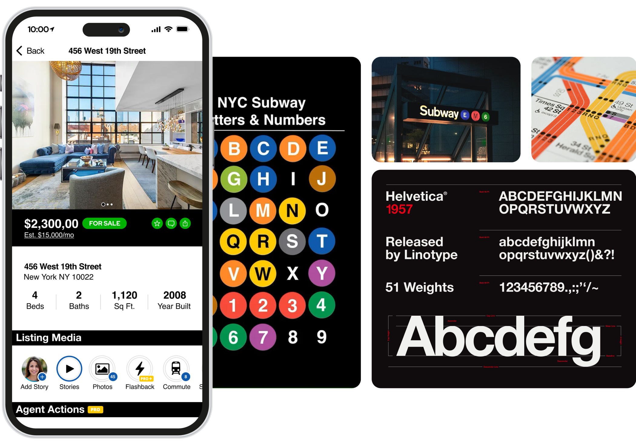
For the initial concept meeting with REBNY, we explored various design options but landed on representing the MTA Subway design, conceptualized by the infamous Massimo Vignelli. As a UI/UX designer it’s important to introduce visual concepts users would be familiar with so a new app would not be as intimidating. When the initial designs were presented to REBNY, we shared inspiration where the visual components came from along with the iconic look and feel Massimo Vignelli came up with for the NYC subway.
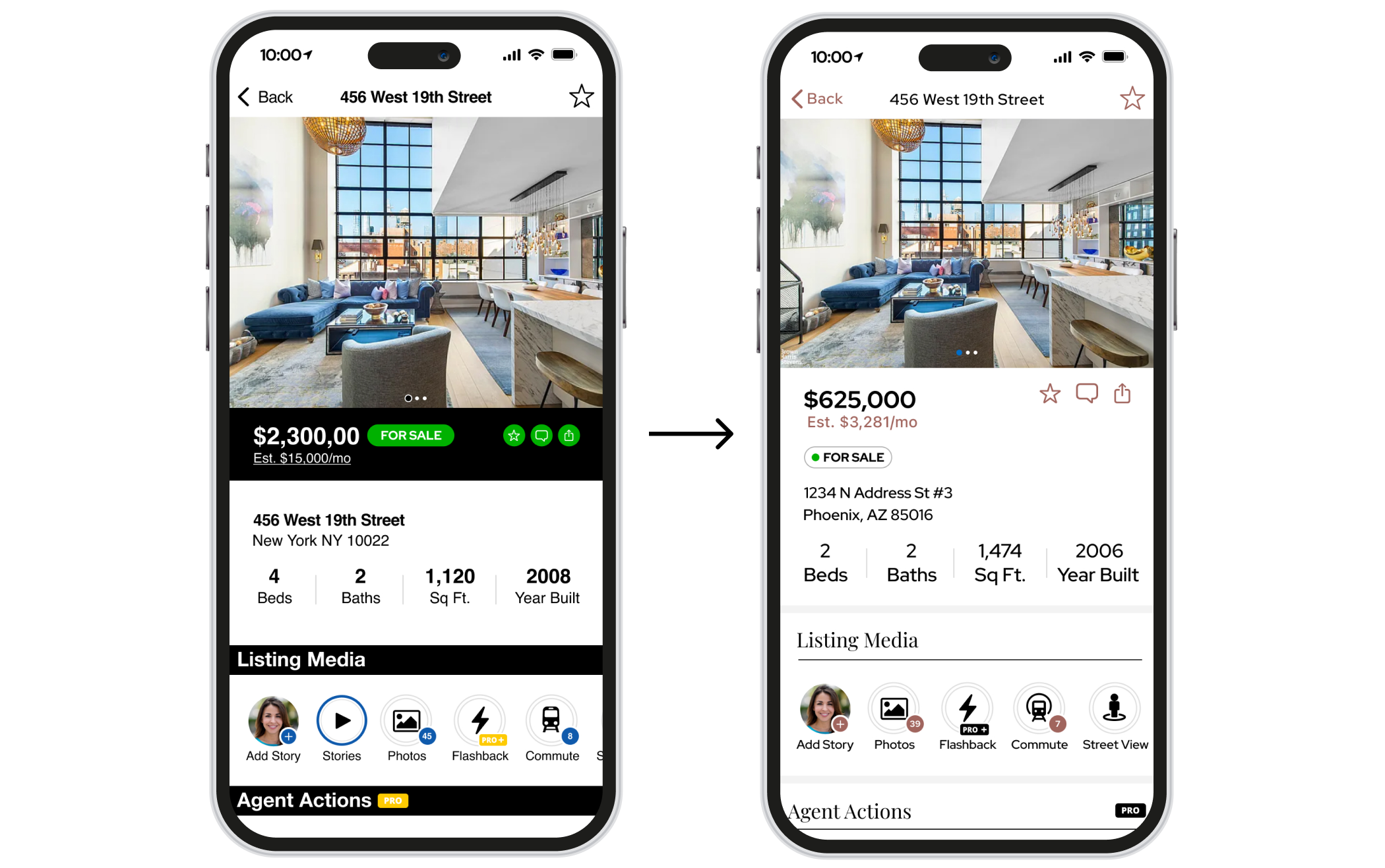
After review from REBNY, we headed back to the drawing board to come up with a look a feel t hey would be happy with.
FEEDBACK
Want a more up-scale look
Less color
Fonts with more character
Likes
Familiarity with an already established brand, the subway system
Easy to read typography
Dislikes
Too much color
Doesn’t feel elegant enough
Outdated
The Vision
After the initial concept was presented to the REBNY board, a weekly meeting cadence was set up with me, the product manager and the project manager from REBNY to discuss new concepts and how we would go about presenting ideas going forward. After many rounds of feedback with the client and addressing the feedback from our first presentation, we came up with the following keywords that would best describe the Citysnap brand and its clientele.
Once these keywords were established, a visual moodboard was compiled to visually represent where we believed the Citysnap brand should go. There was a high focus on fashion couture brands, editorial design and campaigns that focused on muted color palettes.
Creating the Citysnap Brand
The Citysnap logo uses Homesnap’s main logo-type to carry over the pre-existing brand. Homesnap’s house iconography was swapped out with something reminiscent of the infamous Empire State Building in NYC.
Color Palette
The primary color palette consists of Onyx, Taupe and Brownstone along with their corresponding tints and shades to create a wider variety of color options for UI component design.
Typefaces
Citysnap typography introduces Playfair Display for main headers and Red Hat Display, both being web friendly typefaces due to their ease of reading on a digital screen. Playfair was chosen for its elegant serifs, mirroring bold display typography found in editorial design and Red Hat was chosen for body copy. it’s rounder character shape being fun and modern, a nice contrast to the more traditional aesthetic of Playfair.
The Glow-up
Meeting Client Needs & Wants
Citysnap exclusive features
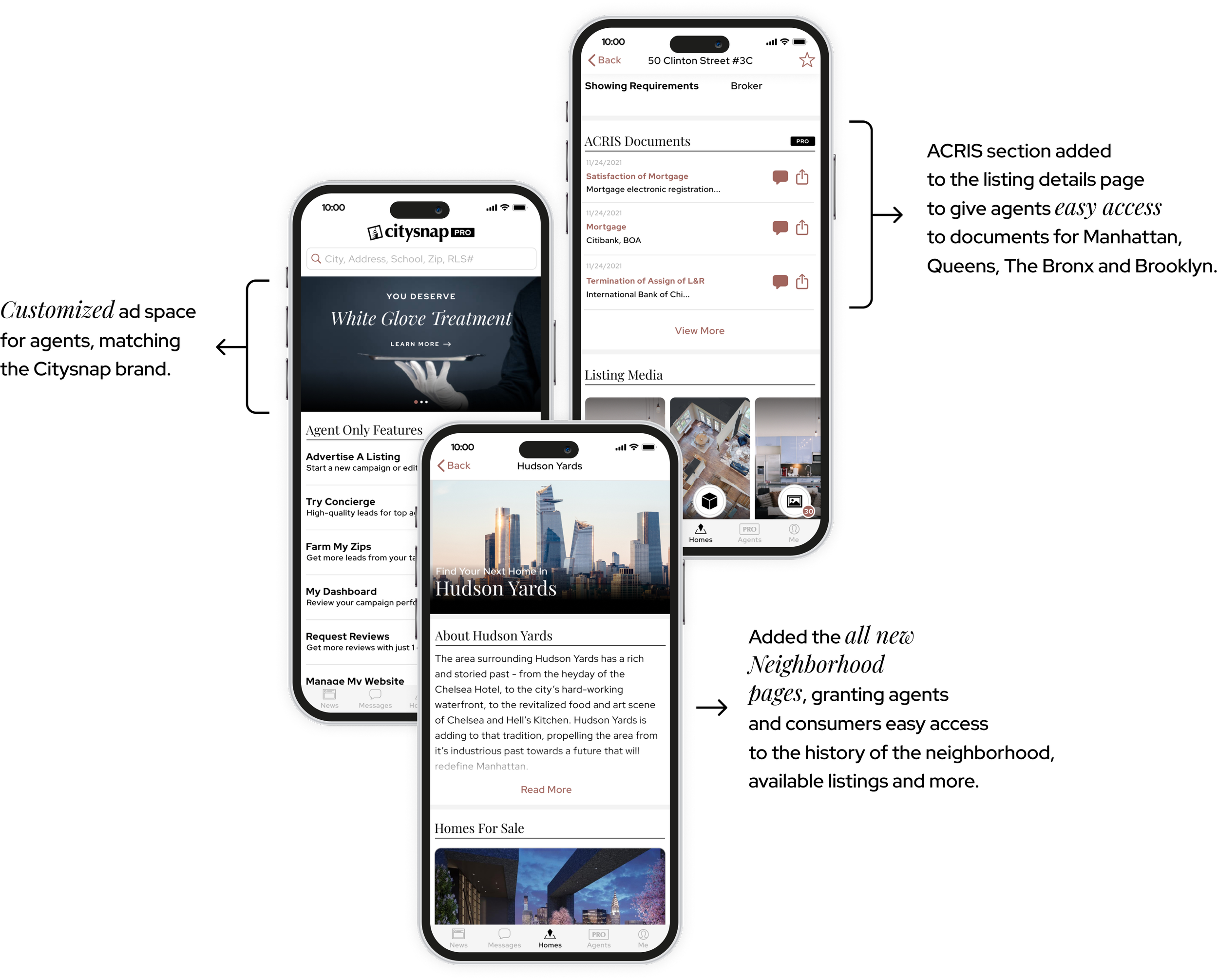
With a demanding timeline, the team chose to utilize Homesnap’s existing native app framework in order to build out the Citysnap App for REBNY. It was imperative to provide a personalized experience for agents and provide consumers a sense of familiarity when it came to the information that was being presented. With those things in mind, the team focused on re-designing personalized ad spaces, implementing ACRIS Documents (exclusive to NYC) to the listing details pages and building out a new page for the plethora of neighborhoods in Manhattan.
Custom Desktop Homepage
Similar to the ad spaces, it was important to wow first time users with a new experience when landing on the homepage. We utilized Homesnap’s search technology and designed a new look and feel as well as a more robust experience by implementing some basic filters up front.
The re-design of the homepage included:
Robust search experience above the fold
Ability to search multiple neighborhoods
Video header
Custom POS section and icon illustrations
Featured neighborhood listing area
NYC neighborhood section, highlighting the top 10 neighborhoods
Key Takeaways 🧐
〰️
Key Takeaways 🧐 〰️
Citysnap was a unique product experience, in that it merged client correspondence and the task to please both the client and its users. The demanding requests and tight deadlines definitely caused internal stress amongst the teams but allowed us to take a step back and I identify what we learned from this project.
Detailed Product Contract
Because Citysnap included an outside client, expectations of the end product should be written out succinctly in the product contract. There is no such thing as too much detail which we learned in the middle of the project when extra features were wanted and we were not able to say no to because of a vague contract.
Client and Team Sync Cadence
The tight deadlined ended up being the biggest hurdle we had to overcome with this project. The beginning was the epitome of a bumpy road because we hadn’t established a meeting cadence to keep everyone aligned on the client side and the Homesnap team side, resulting in miscommunication and time wasted on tasks that could have been cleared up earlier if we had a more streamlined correspondence. Communication is key and while meetings can be a hinderance during the work day, you can always remove them.
Focus on the MVP
Identify early on what defines “The MVP Product” and concentrate on the components that will deliver the most to the user-base, even if that means there will be some visual inconsistencies on the initial launch.


