Role
◆ Lead UI/UX Designer
◆ Component Management
◆ Point person for design and developers
Platforms
◆ iOS
◆ Android
Team
Sarah Sugarman - Senior UI/UX Designer, design lead
Carisa Sumter - Design Team Manager
Molly Simon - Senior Product Manager
Jason Welch - iOS Team Lead
Luis Mierez- Android Team Lead
Madeline Bowden - Senior UI/UX Designer, design support
Lucas Himes - UI/UX Designer, design support
The Goal
Create an elegant and easy to use native design system to assist designers and developers in creating a cohesive product for the Citysnap brand.
The Challenges
Implementation
One of the biggest challenges was implementing a design system into an already established framework.
Multiple Platforms
The design system had to be created for iOS and Android, all of them having their own set of rules that needed to be followed.
Color Palette & typography
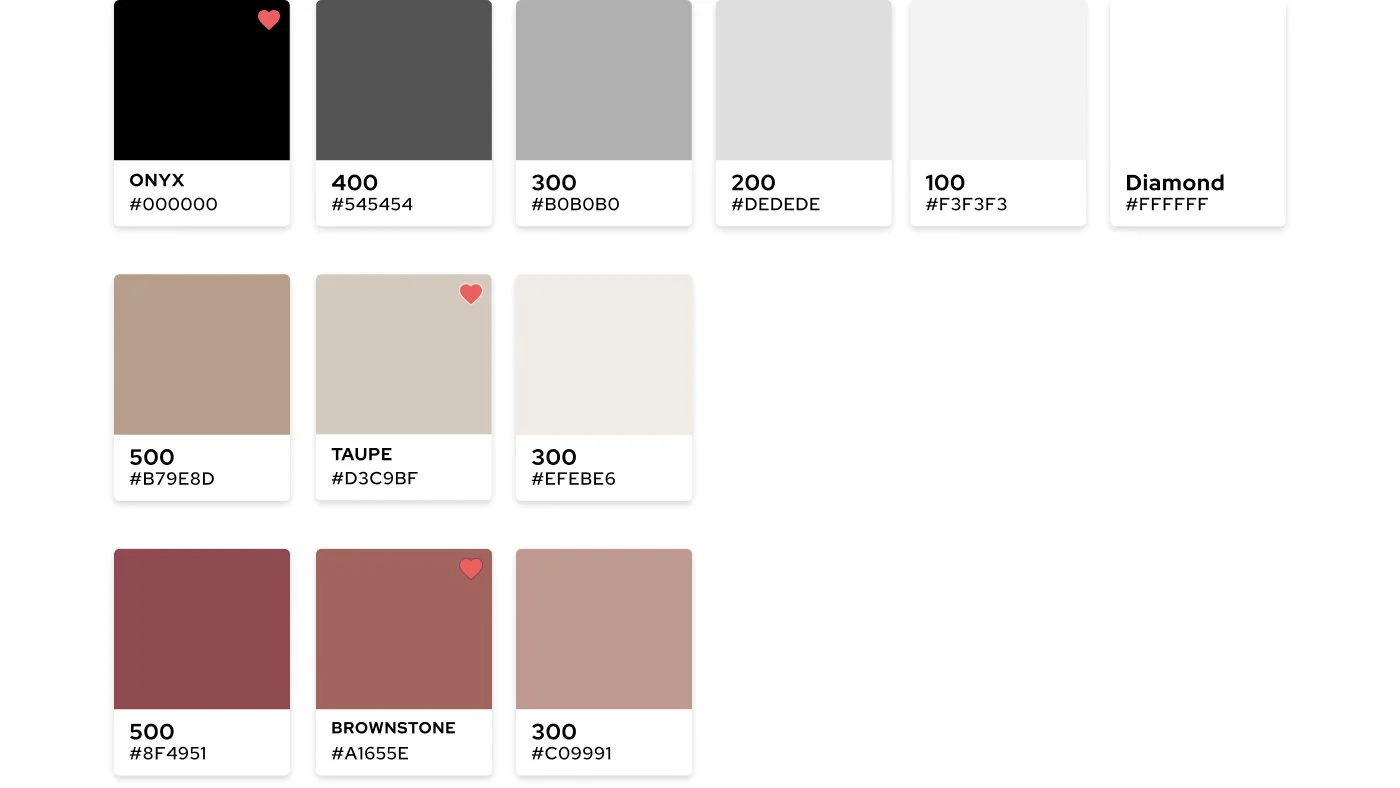
Primary
Onyx
The primary color for the Citysnap design system. This color should be used for things such as the logo, primary buttons,
text, icons etc.
Taupe
The secondary color for the Citysnap design system. It should be used for accent design elements, as a background color
for text or icons etc. Do not use as a text color on a white background.
Brownstone
Named after the infamous brownstone buildings in NYC, this is the accent color for the Citysnap design system. It should
be used for small UI elements such as text links, icons and selected states for things like checkboxes/radio buttons.
Tints and Shades
Semantic Colors
The semantic colors provide color cues to the users about various things within Citysnap such as error states, success states, listing statuses etc. They should never be used for main UI elements or be the focus in a design.
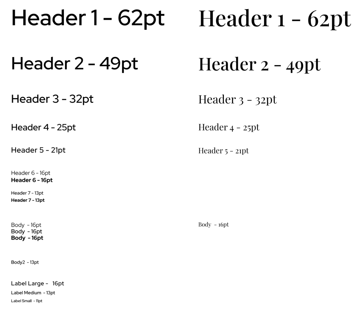
Typography Scale
The biggest hurdle while creating the Citysnap design system was coming up with a typography scale that would work across iOS and Android devices, the starting point being legacy code. The designers worked closely with the native developers to audit the Homesnap app and figure out which type styles currently existed. From there, we paired down font sizes and styling to meet native design system standards and came up with the type scale below.
Buttons
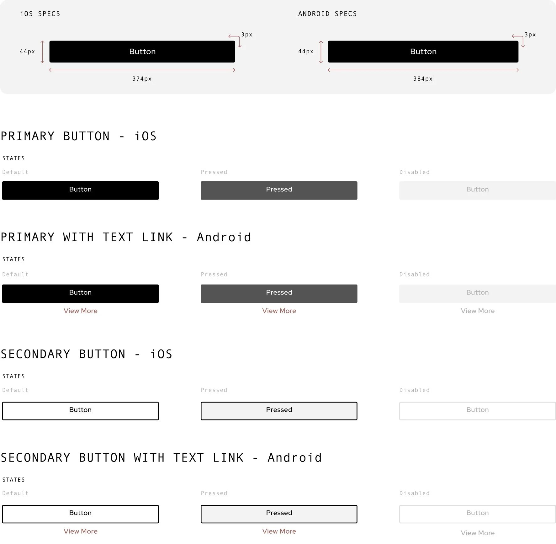
Primary
Lorem ipsum dolor sit amet, consectetur adipiscing elit. Ut eget tristique orci, in semper purus. Mauris porta rutrum orci non semper. Nulla a justo risus.
Secondary
Lorem ipsum dolor sit amet, consectetur adipiscing elit. Ut eget tristique orci, in semper purus. Mauris porta rutrum orci non semper. Nulla a justo risus.
Segmented Controls
Primary Control
Lorem ipsum dolor sit amet, consectetur adipiscing elit. Ut eget tristique orci, in semper purus. Mauris porta rutrum orci non semper. Nulla a justo risus.
Secondary Control
Lorem ipsum dolor sit amet, consectetur adipiscing elit. Ut eget tristique orci, in semper purus. Mauris porta rutrum orci non semper. Nulla a justo risus.


